How to Design Your Living Room
Expert advice on how to design your living room.
1. First things first…paint last! It may seem counterintuitive, but with so many nuanced options, you'll want to get it just right. We used Benjamin Moore’s luscious ‘Galapagos Green’ in an ultra flat finish for the ceiling in our latest living room makeover. Be patient, and be bold!
Botanical Garden Living Room, Photo Credit Dustin Halleck
Best Specialty Art and Framing Project: ASID IL Design Excellence 2021, Photo Credit Dustin Halleck
2. Find your focal point. Every room has a natural center point, whether it's the fireplace, TV, or picture window with an expansive view. Plan furniture around this center line. Sometimes a room can have two focal points, like a TV wall and a fireplace. This is trickier, but with the right sectional, anything is possible. Art is one of my favorite focal points. A good frame makes the piece. Artists Frame Service is our favorite local framer. Art helps set the mood in the space, balances the weight of the room, adds color + texture, and creates a conversation starter.
Pro Tip: I love vacation art. These are special pieces picked up on your travels that bring you back to that time and place. Also, buy art done by family members, local artist’s pieces that speak to you, or try framing your own artwork!
Botanical Garden Living Room, Photo Credit Dustin Halleck
3. Select functional furniture. Opt for tight over loose cushions. You'll save yourself the trouble of constantly cleaning between the seats. Multifunctional furniture is great! Pull up ottomans on casters and add instant seating. Bonus if they cant be tucked away under a coffee table or console. Make sure there’s ample surfaces to live and function. Consider a console behind your sofa, end tables for a wine glass, or a coffee table 18-20" from the sofa edge.
4. Think about function & address traffic flow. Do you host super bowl parties and need seating for 8-10? Maybe the kids need it to be cozy, while you need it to be easy to clean. Perhaps it's just you, your partner, and your dog relaxing after a long day of work. Knowing how you will use the space will determine the direction of the design.
To find a flow, think about how you and your guests are entering and exiting this room. Are two points of entry needed? Does that point of entry cross the path of the TV? Can that be avoided?
5. Layer your lighting. Think ceiling lights, table lamps, floor lamps, and windows. Balance the light in the space. Make sure your lighting is on dimmers to adjust it has a day turns to night.
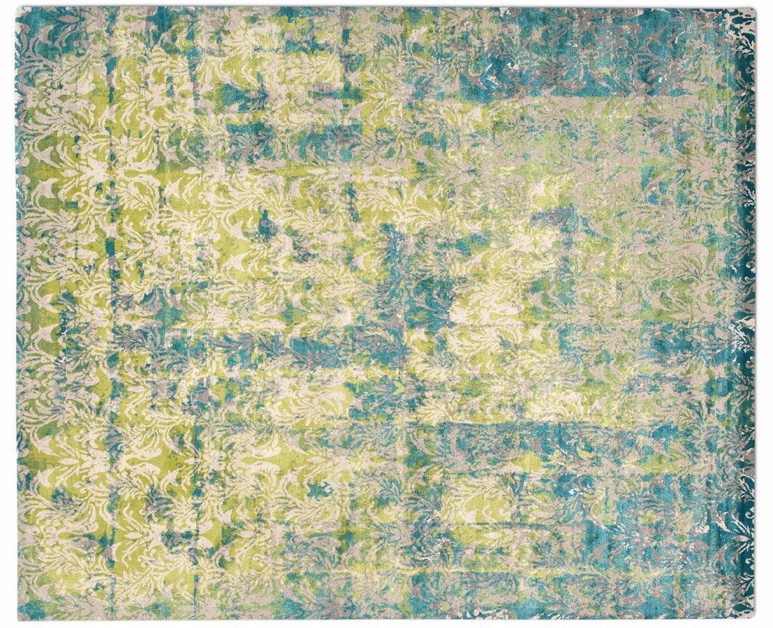
6. Bring in color. Start with the rug. Use the colors of the rug to influence the palette for the rest of the room. Your rug should be large enough that the front two feet of the sofa sit on it comfortably.
“Cover” by Knots Rugs, Sold Exclusively at Integral THread
7. Choose fabrics for your lifestyle. Busy living calls for stain treated or bleach cleanable fabrics depending on your needs (and how rowdy your guests get!) Cozy up with the final layer of pillows. Add in pattern, texture, and trim here. Have fun with it! These can be changed out seasonally or as you want to update your decor!
First Place winner of The Gallery Walk 2021, PHoto Credit Michael Kaskel.
Designer Tips for Styling Your Coffee Table
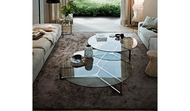
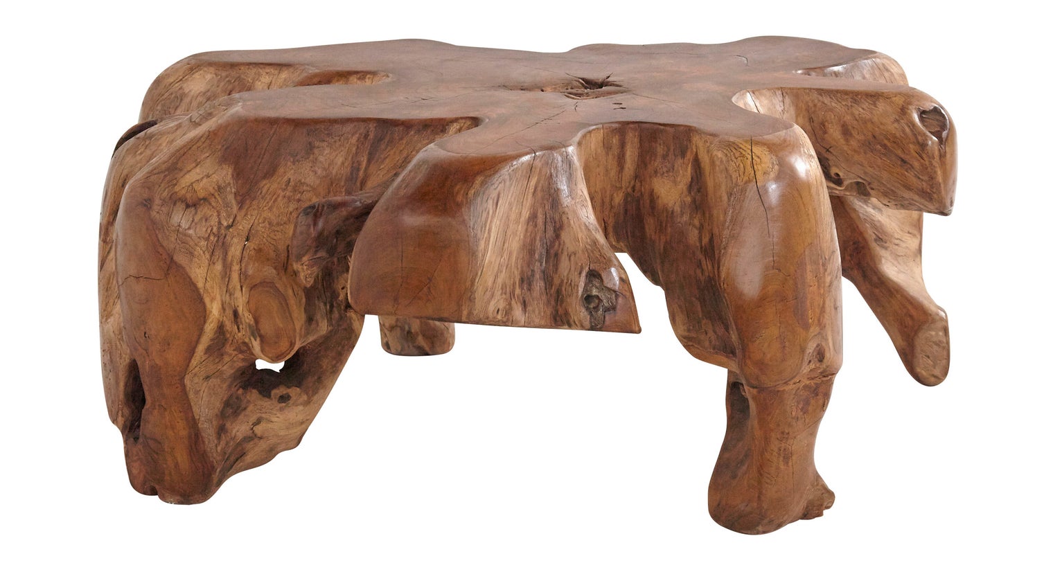
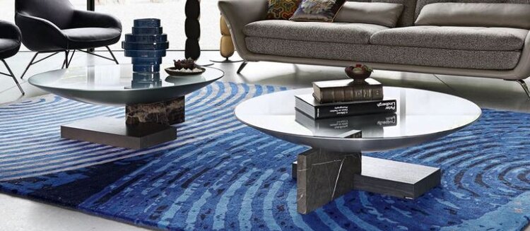
Want to get creative with your coffee table decor? Play around with these different ideas and styles to make your coffee table pop! Last week, we talked about some of my favorite coffee tables right now. This week, we explore a few rules of thumb for styling your coffee table to perfection!
Want to get creative with your coffee table decor? Play around with these different ideas and styles to make your coffee table pop! Last week, we talked about some of my favorite coffee tables right now. This week, we explore a few rules of thumb for styling your coffee table to perfection!
It’s All About Proportion
Choose items to style with that are proportional to the size of the coffee table and to each other. Make sure you’re are varying the sizes of the pieces you choose. Too many “heavy” items will cause an imbalance and visually weigh down the table too much. Likewise an assortment of too many small accessories can feel busy and make the table feel cluttered. Instead, balance visually with an arrangement of a heavier element like a vase of flowers, with a stack of thin books, and some small accent pieces for conversation. Play around with materials! Acrylic is a great option, because it can occupy space on the table, but because it’s translucent it won’t add additional visual weight to your presentation.
Follow The Rule of Three
The rule of three simply states that things arranged in odd numbers are visually more appealing and memorable to the human eye than even numbered groupings. This rule does not only apply to three, but works nicely as five and seven as well. An even grouping of four or six can look staged, while an odd numbered group looks effortless and intentional.
Choose three items (or groups of items) to create the perfect balance. Good examples are stacks of books, a decorative bowl or small sculpture, and a vase of fresh flowers. When choosing books, the title and content is not all that’s important. Consider the color, size, font, spine, and overall aesthetic of the cover as well. The books become part of your homes decor.
Your choice of flowers can be a fun way to bring in a subtle touch of seasonal decorating. Play with color, texture, height and volume. Knickknacks and metallic accents, such as coasters, are a great way to introduce a variety of textures and layer your look.
I Love Decorative Trays
A tray is a fantastic way to layer smaller accessories in an eye-catching way. To mix up the geometry, try selecting a circular tray for a square table, or vise versa. A painted tray is an opportunity for an accent color, like this Spectrum Tray from Jayson Home. Consider a different element, such as metallic, bamboo, or glass to vary the textures and materials. The possibilities are endless!
Get The Right Height
Select a high, medium, and low pieces. A stack of books is a great way to add height or to boost up smaller items. If you have tall and narrow pieces to showcase, you won’t want to add the height of fresh flowers into the mix. Try a succulent or low potted cactus to add more texture and color. Have fun with your selections!
Things To Avoid
Don’t place items on the corner and leave the middle empty.
Don’t go too bare. Fill the table, but don’t overwhelm it.
Avoid lining up your objects. They should fit together nicely like puzzle pieces.
Don’t use items that are so tall that your guests can not see each other across the room.
Don’t design from one view point. Make sure it looks good from all angles.


