Paint Sheens 101
So you’ve selected a paint color! But now you've got another decision to make, what sheen to use. You pull out the little chart that shows the gloss levels increasing, but where to start? You decide that semi gloss is durable, and buy enough for your walls, ceiling, and moldings, one easy decision - right?
So you’ve selected a paint color! You’ve even researched what brand of paint to buy that will keep your home healthy! But now you've got another decision to make, what sheen to use. You pull out the little chart that shows the gloss levels increasing, but where to start? A quick Google search will tell you to never paint your walls in high-traffic areas with anything less than semi-gloss. So you decide that semi-gloss is durable, and buy enough for your walls, ceiling, and moldings, one easy decision - right?
YIKES - this is a disaster waiting to happen. You will end up with a shiny, reflective envelope full of imperfections. I guarantee you will not be happy with this choice.
I see this dilemma far too often with homeowners. Choosing the right finish the first time can save you time, money, and headaches.
Many factors go into selecting the perfect sheen for your application. First, let’s review the basics of sheen. Keep in mind, every paint company will have a different version of these terms and the order of increasing sheen intensity may vary.
The Basics of Paint Sheen
Flat Paint/Matte Paint - No Shine
Flat paint provides a rich depth of color and is great for less than perfect surfaces. Flat paint has the most pigment and will provide the most coverage. Since there is no shine, the light is absorbed rather than reflected. Matte paint is one step up in sheen from flat, but still very low luster. Typically, Flat or Matte finish is the least cleanable option and not good for high traffic areas.
Eggshell - Slight Luster
Not surprisingly, this finish is similar to egg shells. Eggshell offers a real depth of color with a soft and polished look. Good quality Eggshell paint is easy to clean, covers wall imperfections nicely, and is good for moderate to high traffic areas.
Satin - Velvety Luster
Satin is easy to clean, great for high traffic areas, but shows imperfections on flat surfaces. Can be used on walls of high traffic areas or on wood elements.
Semi Gloss - Subtle Shine
Semi Gloss is durable and stands up to repeated cleanings. This finish is often recommended for molding and trims, but can easily show imperfections on flat surfaces.
High Gloss - The Most Shine
High Gloss paint offers a durable finish. It is typically the most easy to clean out of all the paint finishes. High Gloss paint is super shiny and light reflecting. It’s often used for wood elements like cabinets, trims, and doors. Be careful with high gloss though, as it will show all imperfections! While it can be a beautiful look if your walls or ceilings are prepped correctly, it can turn into a disaster very quickly. Surfaces that take high gloss must be perfectly flat with zero imperfections. High Gloss paint requires preparation and a lot of labor to create the perfect end product.
Designer Secrets
A good rule of thumb is that the higher the sheen, the higher the shine and the easier the surface will be to clean. But many advancements in paint technology today allow for lower sheens to be just as durable and cleanable as their shiny counterparts. I’m going to share some tricks of the trade and what I typically use on my client home projects.
Ceilings
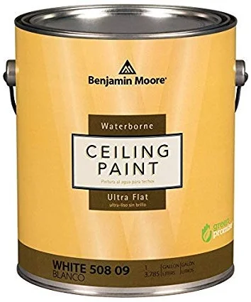
For ceilings, I always use flat paint. Since there is no sheen, it hides imperfections and has a beautiful depth of color. Ceilings tend to be uneven and a flat paint will hide those problem areas and will make the surface look uniform. My absolute favorite product for ceilings is Benjamin Moore Ultra Flat Water Borne Ceiling Paint. It provides a flawless finish and is the flattest finish offered by Benjamin Moore. It is Zero VOC and Engineered with Gennex® Color Technology. Check out my previous post “What’s in Your Paint” for more information on selecting a paint for a healthy home.
Walls
For the walls, I like to use an eggshell finish. It allows for easier clean-ability, but is not too shiny. For walls, I love to use Benjamin Moore Aura in Eggshell finish. It’s a rich and thick paint that provides full coverage, and a beautiful finish with great durability. Good for high traffic areas and it can stand up to repeated washing with no color rub off. It’s a paint and primer in one, mildew resistant, and Zero VOC.
Doors, Baseboards, Trims, Casings, Moldings
I like a satin finish for these wood elements. It’s very durable so it will hold up to normal every day wear and tear. My favorite product for this is Benjamin Moore Aura in a Satin Finish. It’s also great for high traffic areas and it can stand up to repeated washing with no color rub off. It’s also a paint and primer in one, mildew resistant, and Zero VOC.
Bathrooms
Painting a bathroom can be tricky, especially if you don’t want to use a glossy finish everywhere to avoid mildew! Benjamin Moore has a wonderful line of paint called Aura Bath and Spa in a Matte finish. It’s specially formulated for high humidity environments and is mildew resistant. It can stand up to repeated washing with no color rub off. I use this paint on both ceilings and walls in bathrooms for crisp low sheen look.
Cabinets
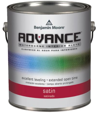
Painting kitchen cabinets is a very technical skill and requires proper preparation. Kitchen cabinets are one of the most commonly touched surfaces and get the most wear. Cabinets must be prepped properly by an experienced painter, primed twice, and then painted. Advance by Benjamin Moore is my “go to” for cabinet painting. As for finish, a paint with some shine is the way to go for durability, so I would avoid Flat paint for this application.
Need More Help with Paint?
Need help selecting paint colors, finishes, or environmentally friendly products?
Paint sheens, Interior paint finishes, Exterior paint finishes, Gloss paint, Matte paint, Satin paint, Eggshell paint, Flat paint, Choosing the right paint sheen, Paint sheen guide, Understanding paint finishes, Best paint sheen for [specific surfaces or rooms], Pros and cons of different paint sheens, How to apply different paint sheens, Paint sheen recommendations, Paint sheen comparison, High-gloss paint, Low-sheen paint, Semi-gloss paint, Durable paint finishes
RNDD Gallery Walk Vignette at Eggersmann
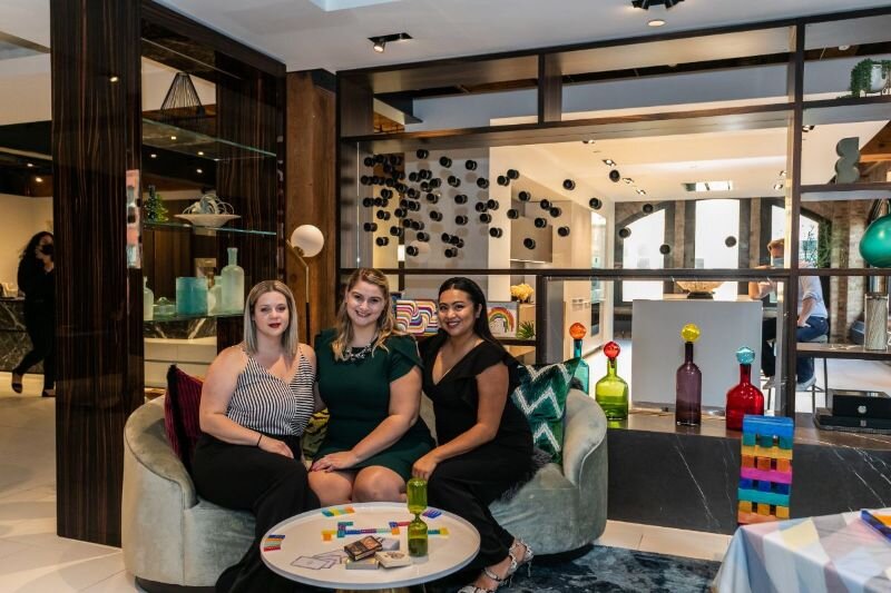
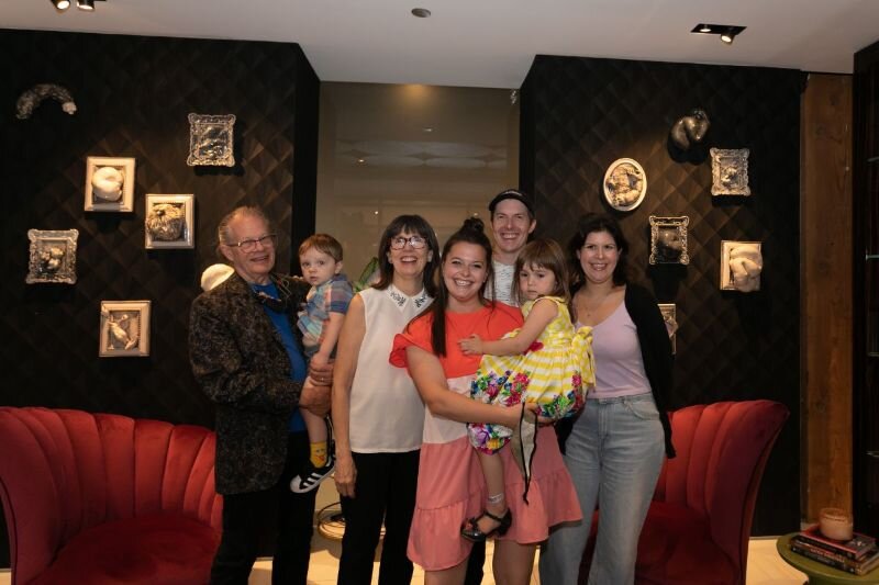
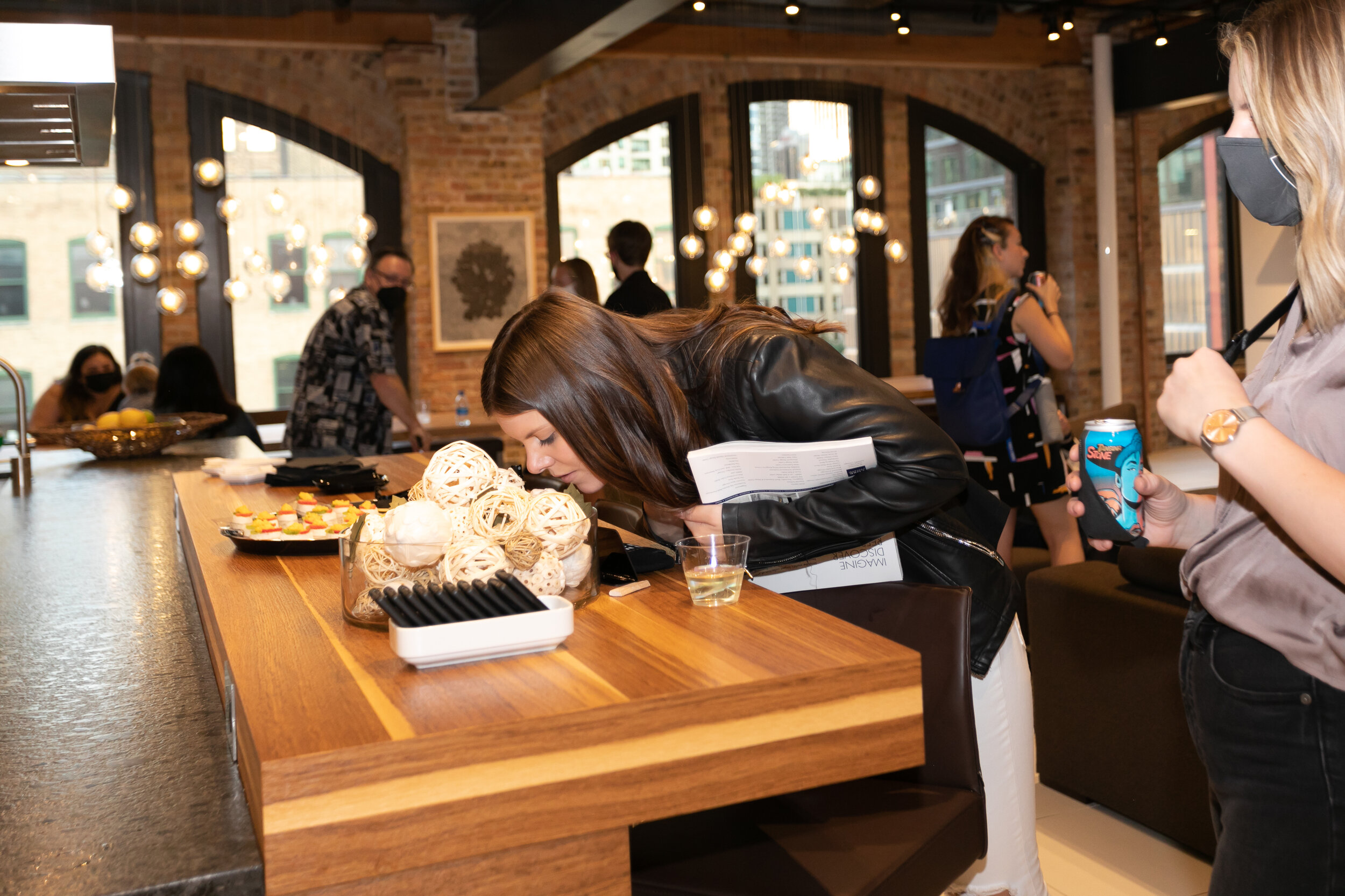
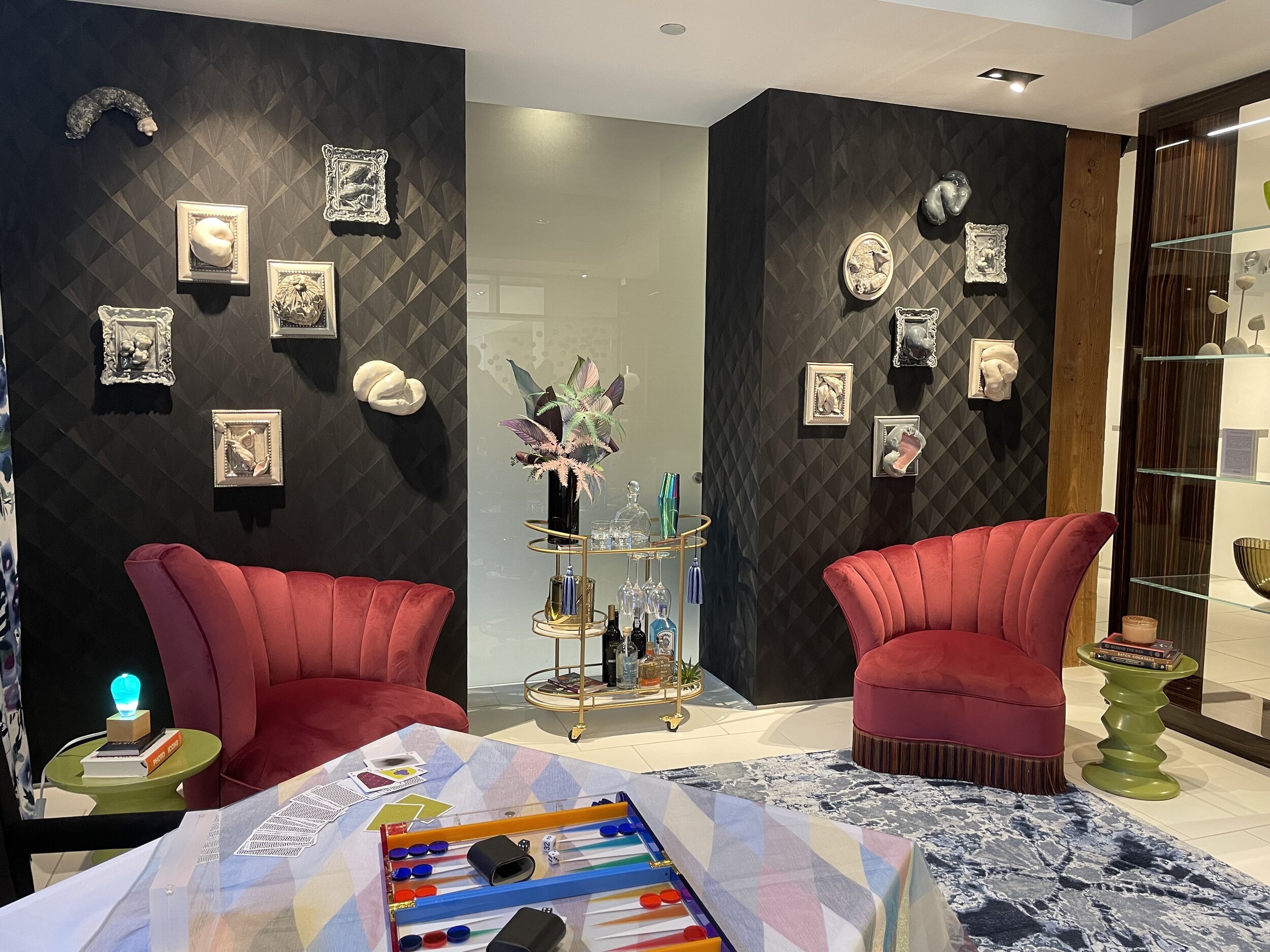
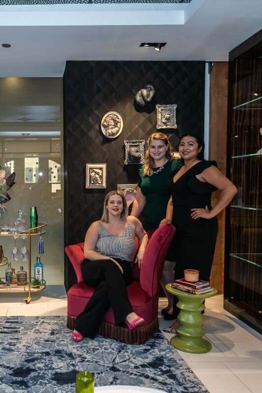
We had such an exciting night this past Friday at the River North Design District’s 6th Annual Fall Gallery Walk! Our vignette was featured at the eggersmann showroom and showcased the intriguing and emotional work of Bobbi Meier.
We had such an exciting night this past Friday at the River North Design District’s 6th Annual Fall Gallery Walk! Our vignette was featured at the eggersmann showroom and showcased the intriguing and emotional work of Bobbi Meier.
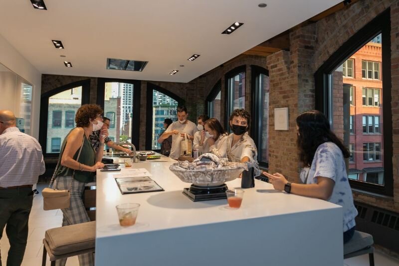
The walk featured 20 showrooms exhibiting designer vignettes from Chicago’s top designers, showcasing living settings highlighting artwork created by some of the brightest stars in the art world today.
We are also pleased to announce that our vignette was awarded Best Vignette Design!
Here are some highlights from our opening night on Friday!
Our Concept Statement
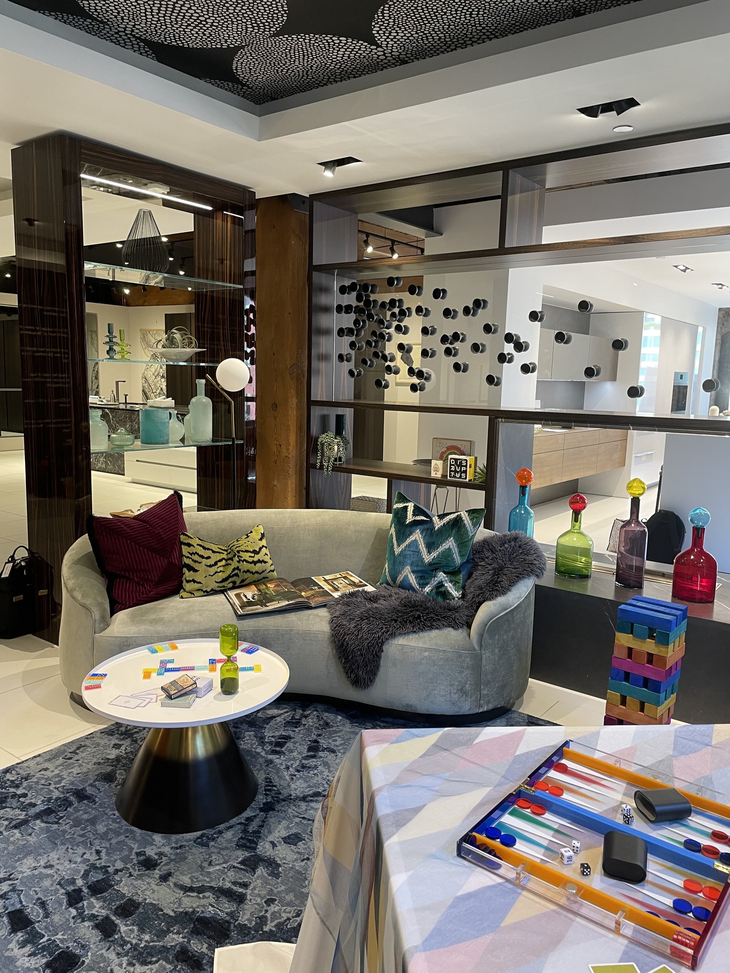
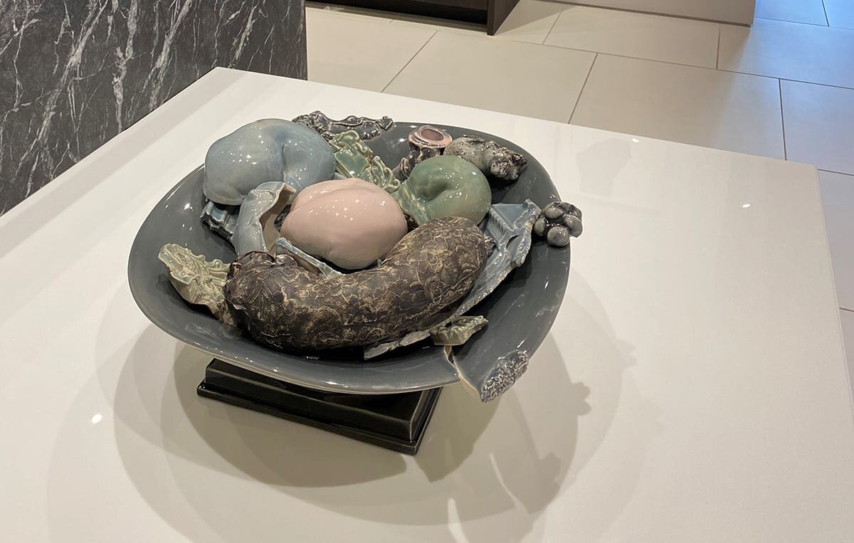
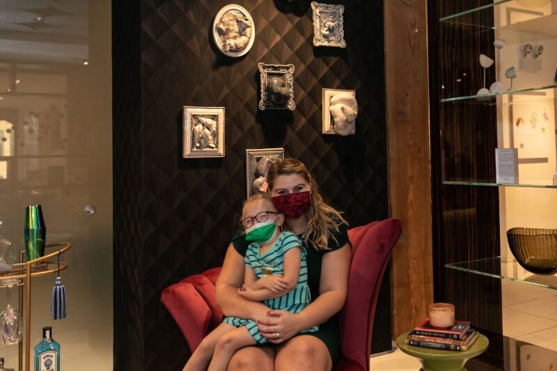
Our vignette, featuring Bobbi Meier’s series Family Portraits, captures the emotional chaos of a family game night. This drawing room is a space to feel; intense colors, textures, and patterns meld together seamlessly to create an atmosphere of excitement and energy that is on the verge of spilling over into madness.
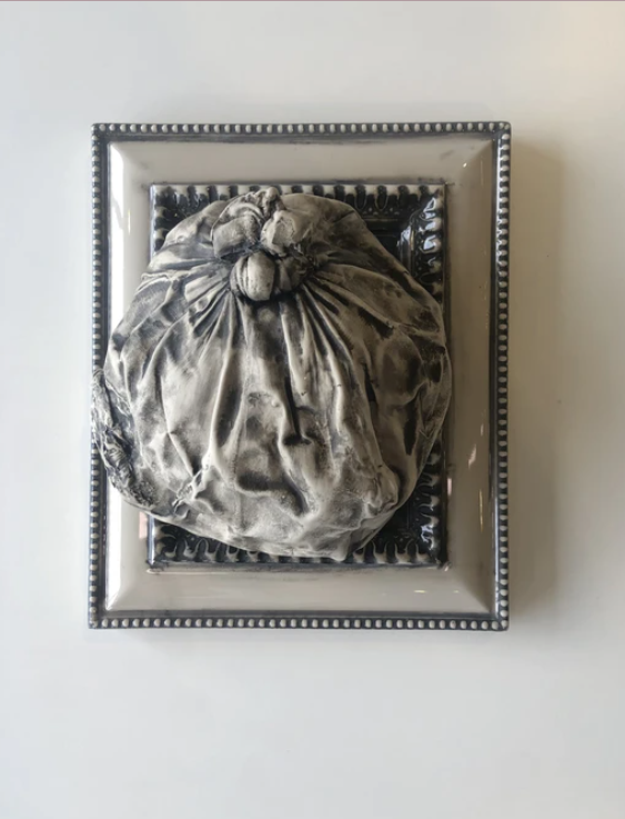
Family Portraits is a series of objects spilling from frames and cast in porcelain. Bobbi Meier writes that “the frame becomes a device to bring tidiness to a messy situation. It simultaneously attempts to entrap and protect an object, which cannot be contained: underlying emotional chaos.” This vignette is a playful take on Meier’s work, inviting you to indulge in an evening of lively gameplay; let loose, have a cocktail, and spill the emotions that emerge during a competitive family game night.
Meet the artist, Bobbi Meier of salonlb.
“Producing work that is sensuous, slightly frightening, and grotesquely humorous has become a means to engage discomfort and anger with situations that cannot be changed.”
Bobbi Meier is a Chicago-based visual artist. She works in various mediums such as sculpture, collage, drawing, photography, and most recently, performance. Her work is realized through provocative use of materials such as pantyhose, spandex, porcelain, and found home furnishings, embedding themes of emotional history, struggle, and loss in its making. (salonlb.com)
Surrender Your Senses
This was truly an evening of the senses!
Sight
Beautiful eye-catching colors, designs, and intriguing art pieces were everywhere.
Taste
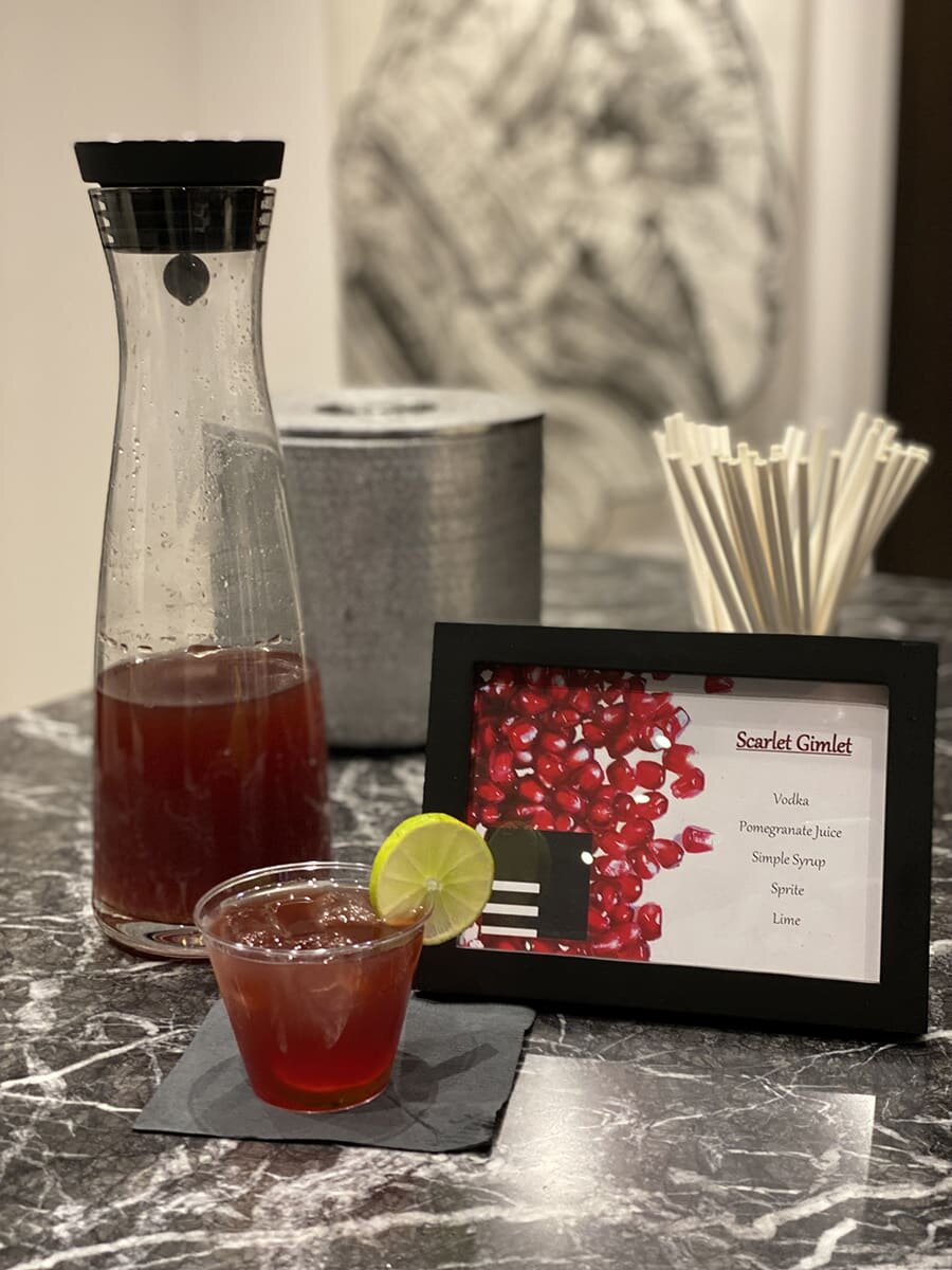
A signature cocktail, the Scarlet Gimlet, savory h'orderves, and decadent desserts were indulged in throughout the evening.
Touch
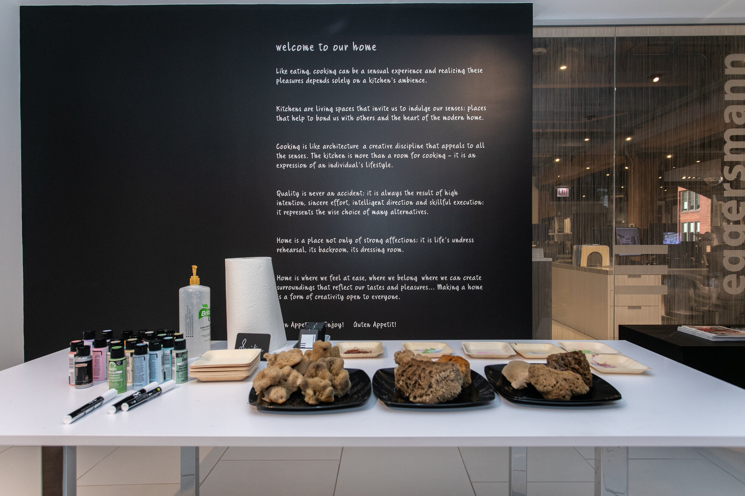
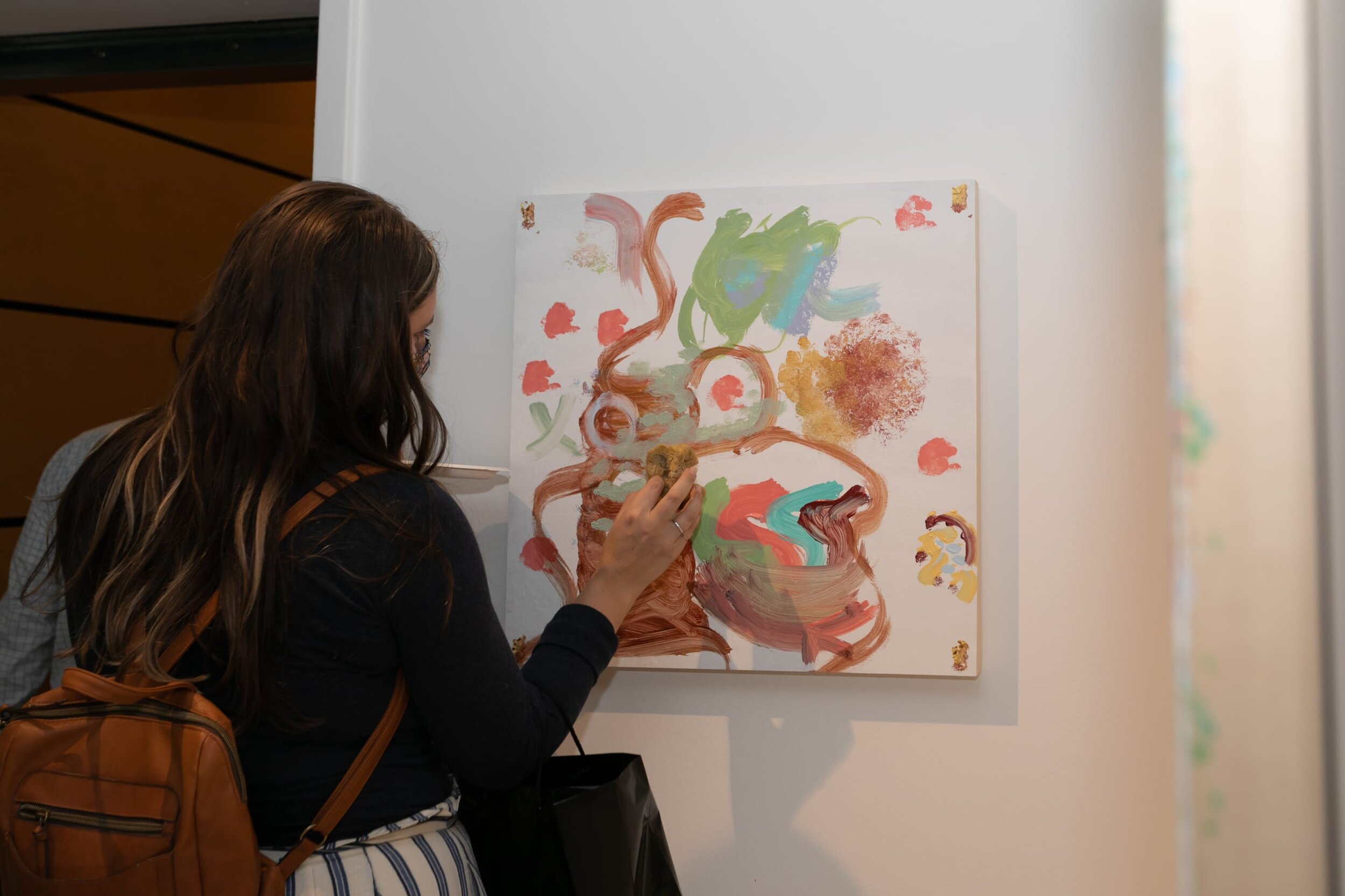
The eggersmann team prepared an interactive coral sponge artwork for guests to add their own colors, texture, and interpretation. The pieces were then raffled off in a social media hashtag challenge!
Smell
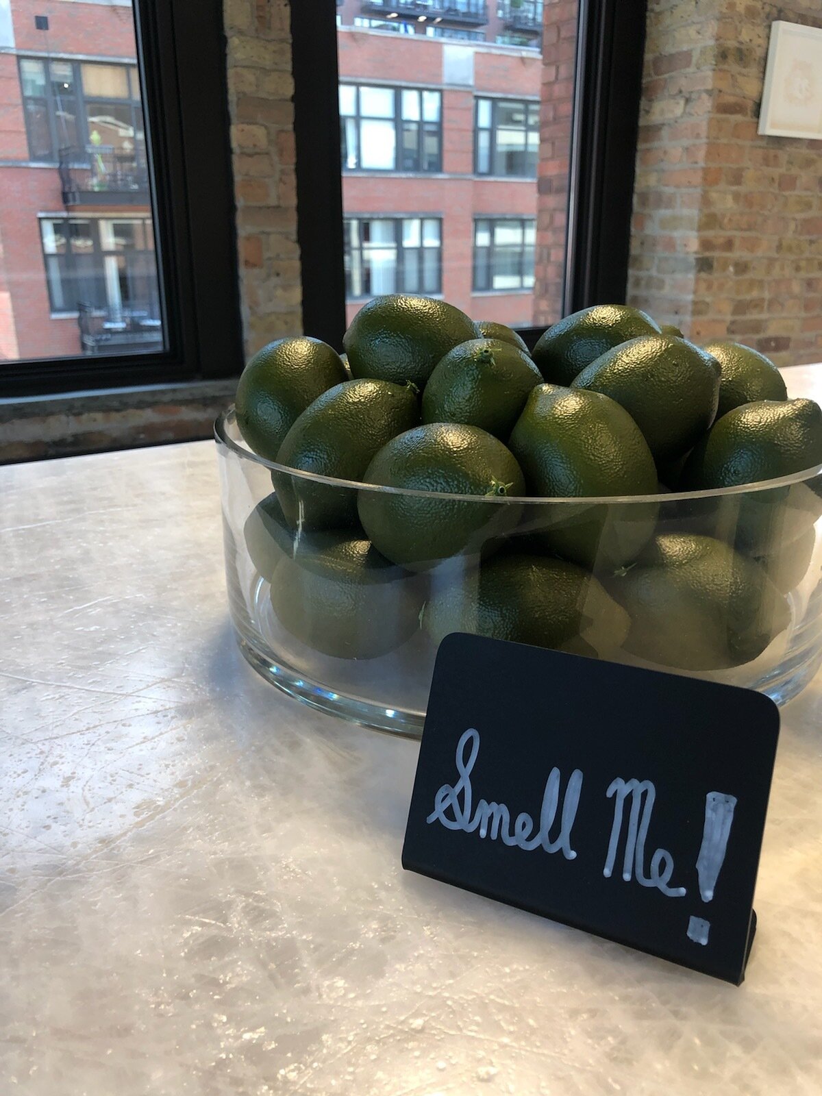
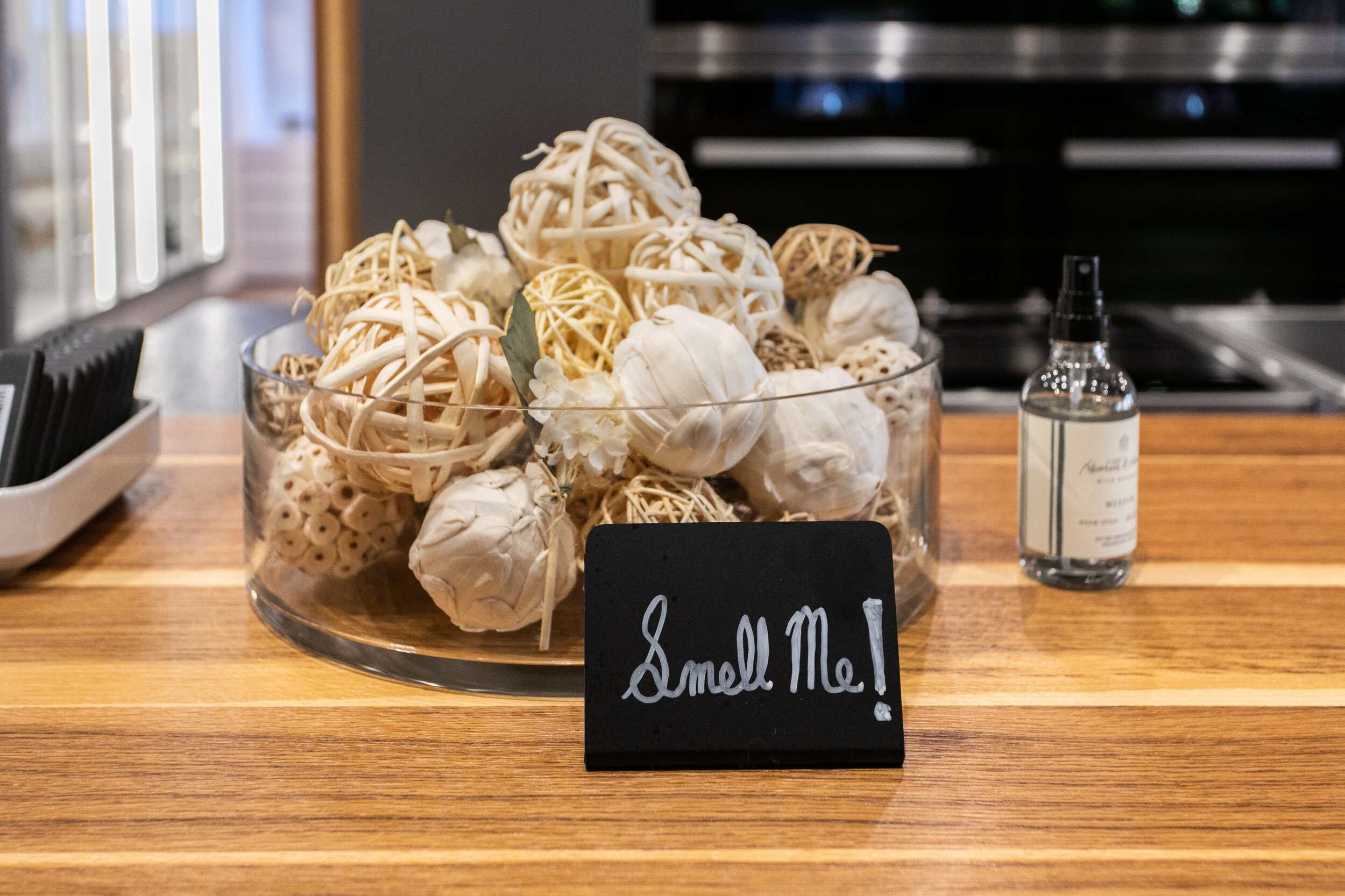
While guests explored the exhibit, we invited them to smell three very different scents of Zest, Smoked Woods, & Meadow.
Sound
A carefully designed playlist surrounded the studio space with a mix of upbeat tempos and contemporary hits.
Missed us last Friday? There’s still time to see our vignette!
The Fall Gallery Walk vignettes will be up in each showroom through October 11.
Make sure you stop by eggersmann at 300 W Hubbard St 4th floor and take a look!
We could not have had such a successful opening night without the help of many hard working individuals! We owe a huge “thank you” to all our contributors!
Our Favorite Decorative Hardware Right Now
Decorative hardware is the jewelry of the space! Whether you’re redesigning your entire home or just giving one of your rooms a refresh, use decorative hardware to add a little beauty and personality.
Decorative hardware is the jewelry of the space! Whether you’re redesigning your entire home or just giving one of your rooms a refresh, use decorative hardware to add a little beauty and personality.
Here are some of the pieces we are loving right now!
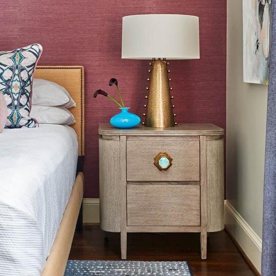
Modern Matter: Harrison Knob
Why we love it: It’s got texture, color, and character! We love adding metal accents to a make a design statement. Plus, it’s completely customizable; choose from eight gemstones and three different finishes. These vibrant colors are everything!
Modern Matter: Kravet Dylan Pull - Polished Brass
Why we love it: These pulls are sure to add luxurious vibes to any room. We love mixing metals into our designs and we are totally here for this polished brass.
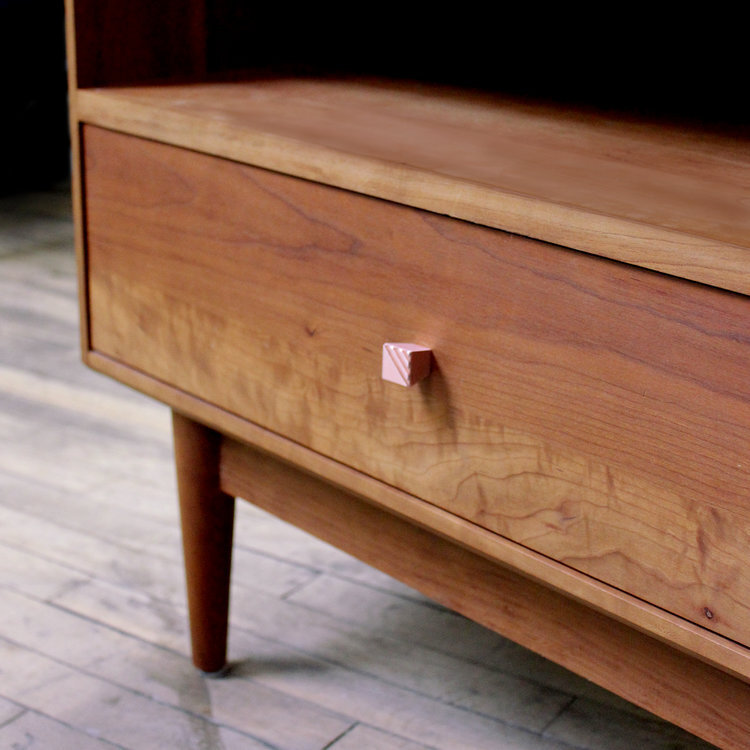
AUZ Design Studio: Small Pyramid Square Knob
Why we love it: These modern square copper knobs add personality to any furniture piece. The finish is so unique and the textured lines on top are subtle and delicate.
Rocky Mountain Hardware: Emerald Cabinet Knob
Why we love it: This crafted hardware has exquisite detail with a handmade look. Perfect for kitchen cabinets in a traditional or transitional design.
Rejuvenation: Kennaston Drawer Pull
Why we love it: The sleek design of these pulls adds chic interest. We love the mix of leather and brass! These would be the perfect addition to a sophisticated kitchen.
Need help selecting the perfect decorative hardware for your home? Schedule a design consultation today!
10 Ways to Style Your Home with Vases
Accessorizing is the final layer when it comes to adding personality to your home. Even the most well designed spaces can look empty without the finishing touches added. One of our favorite ways to dial up the design is with vases. There are so many different styles, colors, materials, and textures to vases that when added, can easily elevate your home! Whether they are made of glass, porcelain, ceramic, wood, or even metal, vases can be just the thing to take your space to the next level!
Accessorizing is the final layer when it comes to adding personality to your home. Even the most well designed spaces can look empty without the finishing touches added. One of our favorite ways to dial up the design is with vases. There are so many different styles, colors, materials, and textures to vases that when added, can easily elevate your home! Whether they are made of glass, porcelain, ceramic, wood, or even metal, vases can be just the thing to take your space to the next level!
Here are 10 Ways to Style Your Home with Vases:
1) Make a statement in the foyer! Use an interesting, eye catching piece that will WOW your guests when they first walk in!
2) Decorate your living room coffee table! Remember the rule of 3’s when it comes making an arrangement. A decorative vase with flowers pairs well with a stack of books and a decorative tray.
3) Create a garden oasis in your living room! Go over the top with a big decorative vase and robust arrangement of flowers on the table.
4) The fire place mantel is calling! Use an assortment of two, three, four, our even five matching transparent vases with flowers to add airiness and natural elements to your mantel.
5) The kitchen island is a great place to bring in freshly picked flowers from the garden and add some style to the space.
6) Add visual height to a bedroom console by adding a tall sculptural vase, added flowers are optional!
7) Pick a vase with unique personality to use as a conversation starter when new guests come to visit!
8) Decorative vases are great for adding tactile and visual texture to a space, which creates a dynamic room design
9) Vases are perfect for bookshelves that need to be styled. A glass vase makes a great counterpoint and adds interest to wall full of books.
10) The dining room table is the perfect place for long stemmed vases. These vases leave a clear opening for your guests to talk across the table, while adding height to the space.
Need some inspiration?
Here are 8 gorgeous vases we are crushing on right now!
Need help accessorizing your home? Schedule a design consultation today!
Interior Design and COVID-19
COVID-19 has impacted us all in different ways. We are learning new ways to cope, connect, and move towards a new normal. Through all of these changes and isolation, we have learned just how important it is to have social support from our friends, families, and colleagues. One of the big questions we face as interior designers is “How will the architecture and design community be impacted by COVID-19?”
COVID-19 has impacted us all in different ways. From tragic loss of lives, to lay-offs and business closures, the strain on our emotional, physical and mental health has been incredibly difficult for each of us in our own way. We are learning new ways to cope, connect, and move forward towards a new normal. Through all of these changes and isolation, we have learned just how important it is to have social support from our friends, families, and colleagues. We’re all missing human bonding.
Our lack of in person contact can trigger what Vivek Murthy, a physician and former surgeon general of the US calls a social recession - “social isolation that has a negative impact on physical and mental well-being of people and can even put us at risk for premature death.” There is reach that links social isolation and loneliness to poor health outcomes such as heart disease, dementia, sleep loss, depression and reduced life expectancy.
To help prevent isolation and a social recession, we need to ensure we are connecting with people outside our home for at least 15 minutes a day. Whether that be a phone call, video chat, or safe distance visit. It’s also important that we take time to help other people, be more conscious of others, and see the bigger picture of how we fit into our community. There are many beneficial health and wellness outcomes associated with acts of generosity, charity, and community bonding. A main one being increasing our sense of belonging and decreasing feelings of isolation and loneliness.
Office Spaces
One of the big questions we face as interior designers is “How will the architecture and design community be impacted by COVID-19?” This is a loaded question, but ultimately, I believe this situation has given the design community the opportunity to be creative in new ways.
As we begin to reopen and return to offices at reduced capacity, new protocols are being implemented, as we disinfect our desks, chairs, keyboards, mouses, and phones daily. Our perspective and safety views on the office environment has changed, as we have all adapted a heightened sensitivity to touch and awareness of social distance. Even with new cleaning policies, there are still challenges with our current office layouts, conference room sizes, elevator capacity, distancing capabilities, and privacy that need to be addressed.
This is where designers and architects come in. We design spaces for people, and the way we design these spaces is going to change.“We’re coming to realize that as designers, architects, and building managers, we have a critical role to play in public health.” (Rachel Gutter, President of IWBI). We will be designing safer work spaces, with social distancing protocols, re-imagined office layouts, specifying materials that are easily cleanable and implementing maintenance schedules. The effects of COVID-19 will impact the way we think about and design spaces of the future.
Work From Home Life
This world wide social experiment of “Can we all really work remotely?” has sparked conversations among many companies on if they even need to return to a physical office. Companies like Google, Twitter and Facebook have embraced the option of the remote work lifestyle permanently. This opens the opportunity for people anywhere in the world to work for these companies since you don’t need to be present at a physical office everyday. Businesses have learned to adapt to the work from home life, and some are even working more efficiently than they did in the actual office. Benefits of remote work are:
Less Time Spent Commuting
Improved Employee Retention
More Independent Employees
Reduced Operating Costs
Diverse Candidates
Efficient Use of Technology
Increased Productivity
Positive Environmental Impacts
Better Work Life Balance
Healthier Employees
Less Stressed Employees
Financial Savings
Customized Home Office
Healthier Employees
Improved Creativity
More Time with Family
Many businesses are seeing these great benefits and investing more in their work from home employee support. A company's ability to do this depends on it’s type of work, flexibility, culture, access to technology and the ergonomics of the employees home. Even after the pandemic, work from home choices will be more of an option than ever before. Studies show that employees with the highest level of satisfaction are those who have options of where, how and when they work.
Residential Interior Design and Wellness
With more people working from home, this will change the way we design residences, specifically by creating a designated office space. Things to consider are layout, placement in the home, acoustical privacy, storage, supplies, sustainable components, ergonomics, clean-ability, healthy building materials, and incorporating strategies to avoid burn out. Creating a new lifestyle where home and work life co-exist in the same space. We’re seeing a major need for these newly developed, creative and healthy spaces in the home.
With a progression towards health and wellness in all facets of our life, and a desire for a cleaner and safer environment due to COVID-19, the Design and Architecture industry is taking great strides to incorporate human health into our environments. WELL Certification is about placing people at the heart of design and enhancing the human health and well being experience. It’s a certification process for buildings, backed by evidence based health and scientific research with leading physicians, scientists and industry professionals.
Over the last few months, I have seen the positive value that the WELL Certification can bring to me as a designer and to my clients. I am working towards earning my WELL AP certification to be able provide health and wellness education and support in our interior design projects. “A WELL AP denotes expertise in the WELL Building Standard and a commitment to advancing human health and wellness in buildings and communities around the world.” (wellcertified.com)
The WELL certification provides me with a unique understanding of how the human body is impacted by our indoor and outdoor environments, and how to create a healthier home for my clients. From contaminants in our water and air, lighting consideration and temperature controls, to healthy eating and fitness, WELL Certification covers all this and more to ensure buildings and their occupants health and wellness take priority, increasing the quality and longevity of our lives.
Stay tuned for more on my journey to becoming a WELL Accredited Professional and follow SJI on Instagram for #WellnessWednesday
A Night of Color at Artists Frame Service: Our RNDD Gallery Walk Vignette
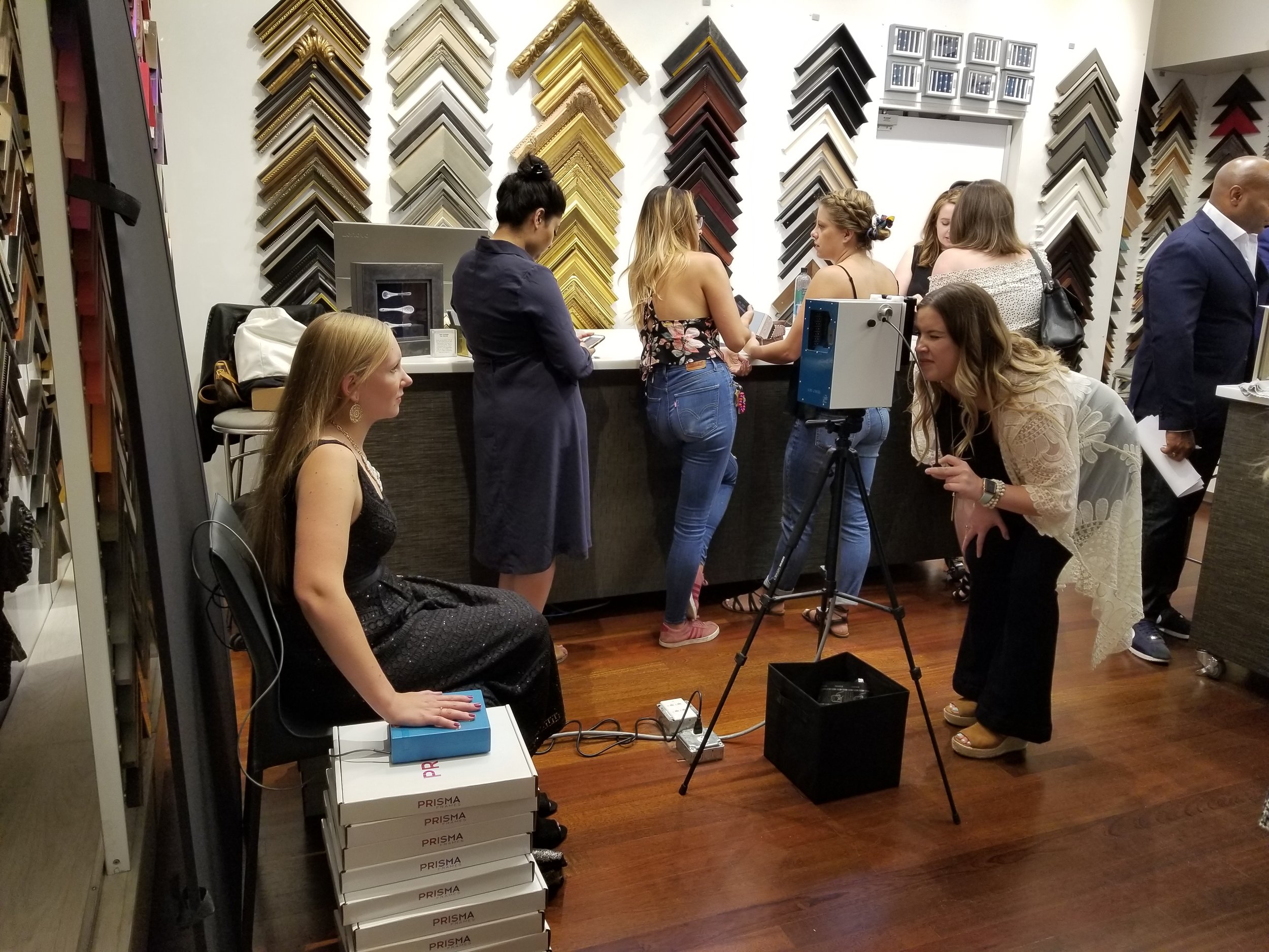
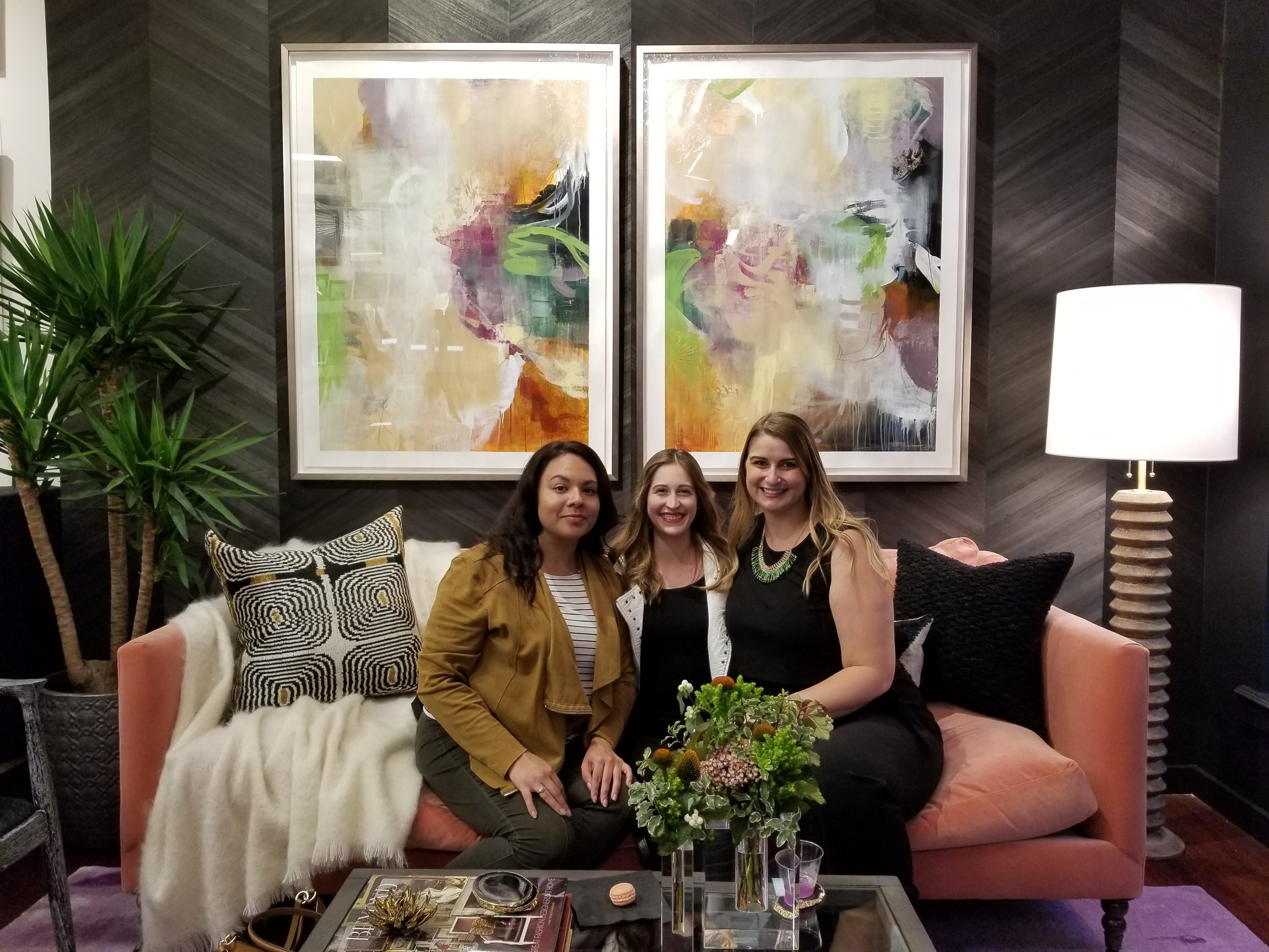
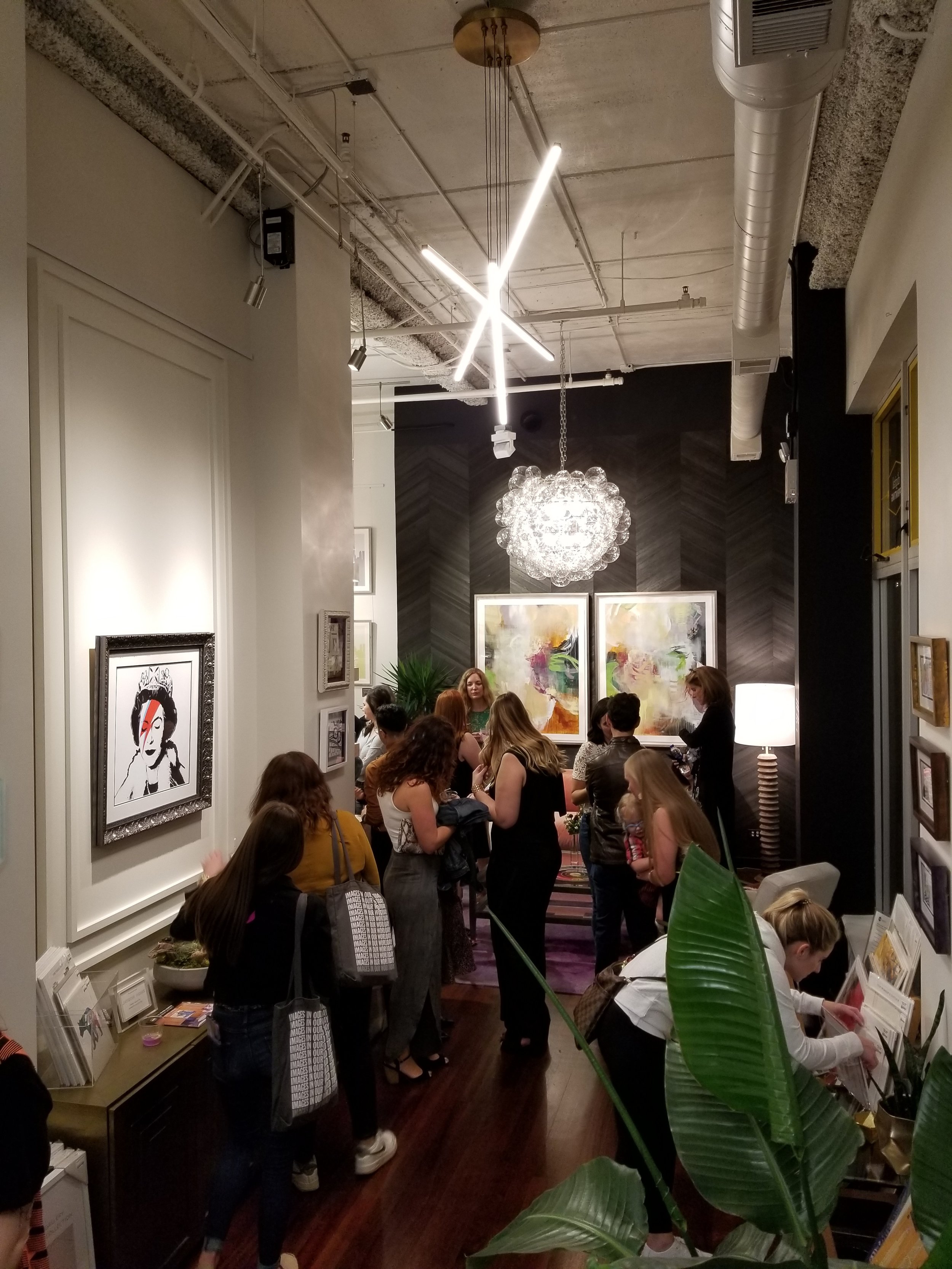
We had such an exciting night this past Friday at the River North Design District’s 5th Annual Fall Gallery Walk! Our vignette was featured at Artists Frame Service and showcased the ethereal art of gallery 1871’s Cat Tesla. We captured our true colors with aura photographer Revealing Soul, were captivated by color-changing cocktails, and enjoyed fabulous company and great conversation.
We had such an exciting night this past Friday at the River North Design District’s 5th Annual Fall Gallery Walk! Our vignette was featured at Artists Frame Service and showcased the ethereal art of gallery 1871’s Cat Tesla. We captured our true colors with aura photographer Revealing Soul, were captivated by color-changing cocktails, and enjoyed fabulous company and great conversation.
The walk featured 33 showrooms exhibiting designer vignettes from Chicago’s top designers, showcasing living settings highlighting artwork created by some of the brightest stars in the art world today.
Here are some highlights from our opening night on Friday!
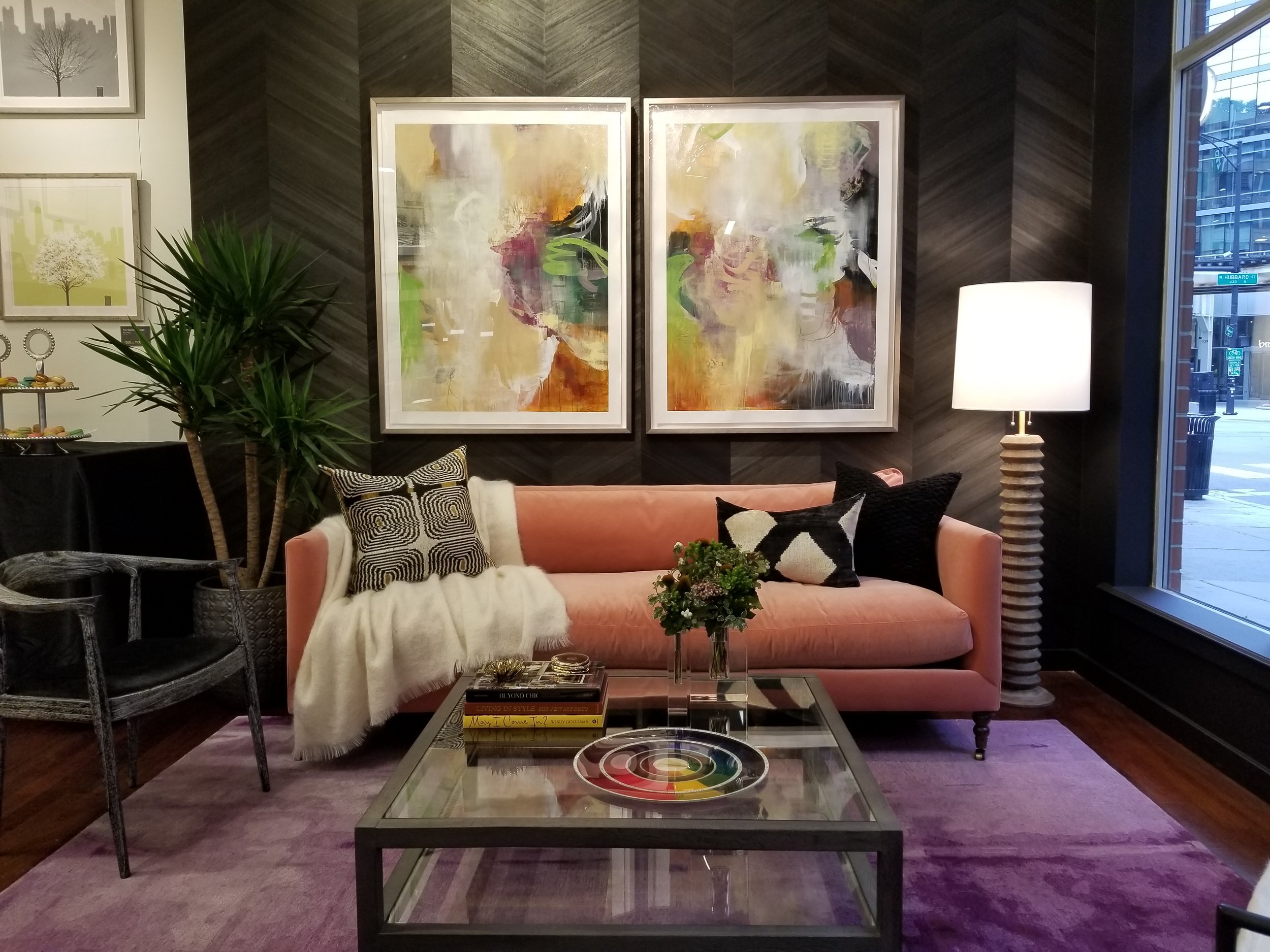

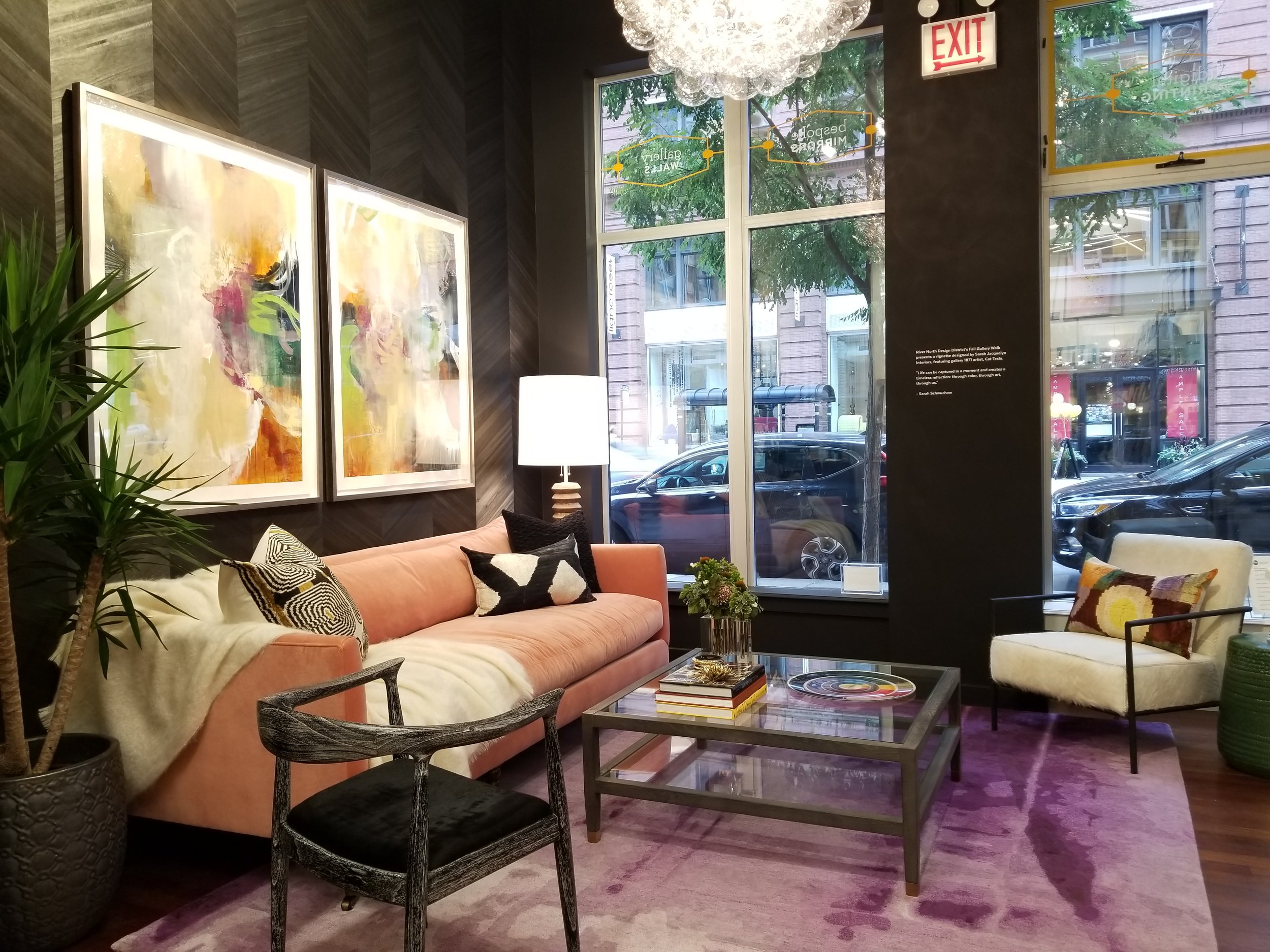
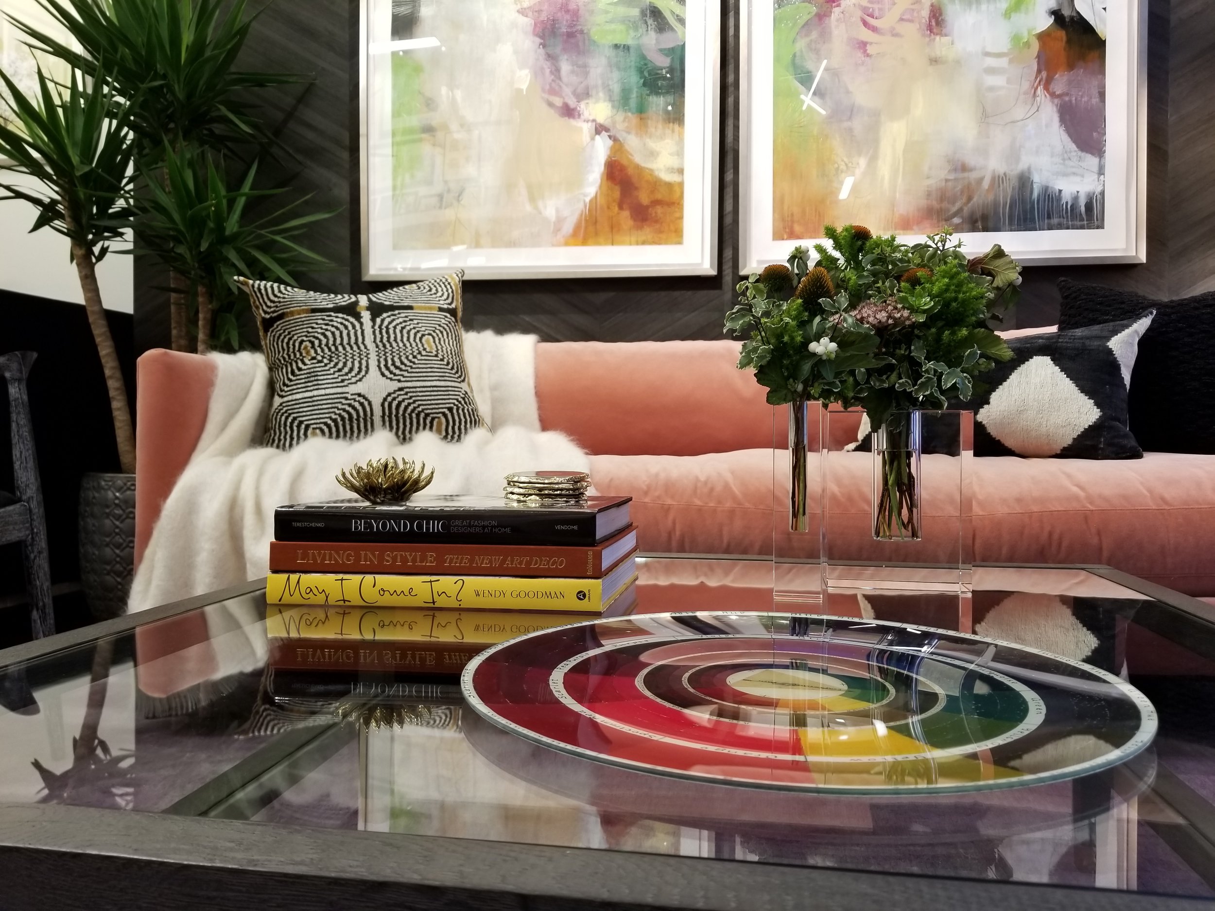

Our Color Changing Cocktail - The Chroma!
These were so fun to watch and they were also super delicious!
Meet the artist, Cat Tesla of gallery 1871
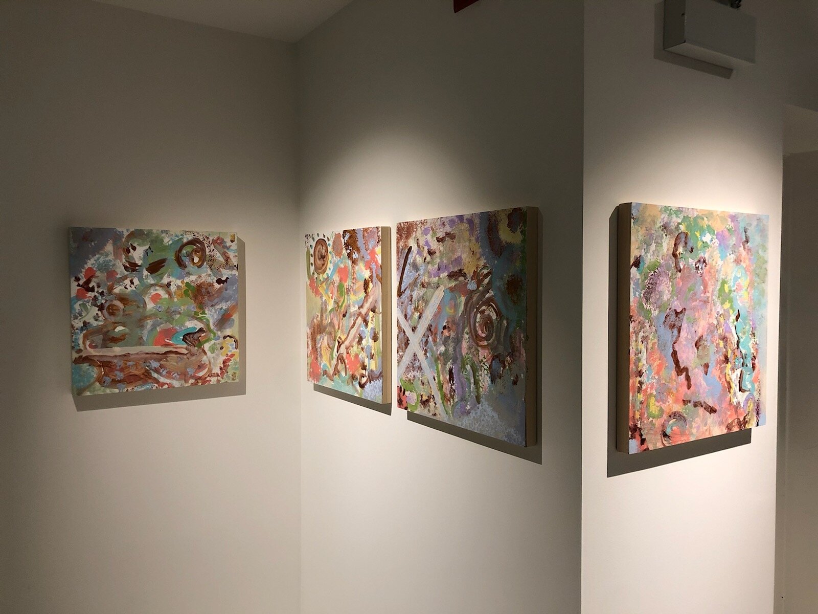
“My work includes both ethereal landscapes and abstract designs. The subjects I choose to paint are organic, either originating from Mother Nature, or inspired by her. I love building layers using painting and drawing, scraping back, then adding more, pooling juicy paint, and pouring glossy translucent glazes over the surface. My artwork provides the viewer with a bold graphic element from a distance, but up close they're rewarded with rich organic details and texture.”
Cat Tesla is an international artist of 22 years. After a high-stress profession working in human genetics, Cat turned to the natural world, meditation, and yoga. She began studying art in the evenings and went on to obtain a degree in graphic design, followed by studies/residencies with Nicholas Wilton and Steve Aimone. She was “inspired to put nature to canvas - the shapes, colors, and feelings.”
Cat is a resident artist of gallery 1871 of Chicago Art Source. Her Timeless series pieces featured in our vignette are available for purchase.
Aura Photography by Revealing Soul
Aura Photography is the art of capturing an individual’s aura through photograph in a beautiful array of colors. Revealing Soul was an amazing addition to the evening, taking plenty of photographs and offering free readings!
According to my aura’s colors, I am career oriented and currently experiencing an abundance of growth; I am going through a transformation of personal balance. I’d call that a great reading!
Missed us last Friday? There’s still time to see our vignette!
The Fall Gallery Walk vignettes will be up in each showroom through October 7.
Make sure you stop by Artists Frame Service on Wells street and take a look!
We could not have had such a successful opening night without the help of many hard working individuals! We owe a huge “thank you” to all our contributors!
The Psychology of Color in Interior Design
I love using color as a communication tool in my interior design projects. In order to do that effectively, it’s important to understand how colors behave and how they can influence our mood. Color psychology suggests that some colors may increase anxiety, while others can boost your energy level. Your home should be your sanctuary, so it’s important to understand the emotional impact a color will have in your home.
I love using color as a communication tool in my interior design projects. In order to do that effectively, it’s important to understand how colors behave and how they can influence our mood. Colors evoke emotional responses in everyone. The psychology of color is used around us every day and is an important tool for transmitting information. A red stop sign prompts you to stop and look around; a brightly colored playground evokes feelings of joy and youthfulness.
The colors you choose for your walls and furniture have a big impact on your mood and emotions too. Color psychology suggests that some colors may increase anxiety, while others can boost your energy level. Your home should be your sanctuary, so it’s important to understand the emotional impact a color will have in your home.
Here are some things to take into consideration when choosing a color palette.
“Color is a power which directly influences the soul.”
-Wassily Kandinksy
Red
Red is the color of passion and drama. It attracts the most attention and is often associated with strong emotions such as love and anger. Red is used universally to communicate danger or power. While it is vibrant and exciting, it also inspires feelings of lust with a strong link to sexuality.
Color psychologists have proven that red can increase blood pressure and stimulates the adrenal glands. In color therapy, red is often used to help dispel negative thoughts and release anger.
Red | Emotions
Excitement
Energy
Passion
Attention
Orange
Orange is the color of optimism and is socially inviting. This color is for the extrovert, exuding energy and motivation. The combination of yellow and red makes orange, conveying warmth and excitement and typically appeals to younger people. Orange is often used as a natural antidepressant in color therapy and can relieve feelings of self-pity. It is also thought to help strengthen the immune system and aid in digestion.
Orange | Emotions
Optimism
Independence
Adventurous
Creativity
Youthfulness
Yellow
Yellow is full of energy and happiness. It conveys youthful optimism and freshness. The color of sunshine, it is uplifting and illuminating and often associated with success and confidence. Yellow stimulates the left side of the brain, which aids in clear thinking and quick decision making.
In color therapy, yellow is used to create uplifting feelings. It stimulates the brain and can make you more alert and energetic. Yellow also builds self confidence, yet some may find that it can also trigger feelings of fear and anxiety.
Yellow | Emotions
Enthusiasm
Opportunity
Spontaneity
Happiness
Positive
Green
Found in all of nature, green is the color of growth and health, expressing renewal and life. Green has a strong association as a refreshing and peaceful color. It evokes feelings of abundance while providing a restful and secure feeling.
Green is thought to be good for your heart and also helps you breathe slower and deeper. It creates feelings of comfort and relaxation as we are reminded of nature. However, olive greens have been known to convey thoughts of decay and death and may be detrimental to psychological and emotional health.
Green | Emotions
Safety
Harmony
Stability
Reliability
Balance
Blue
The hue of the sea and sky, blue communicates a tranquil emotion that induces peace and serenity. This calming color instills confidence and inspires feelings of loyalty, integrity and responsibility. A cooler blue is conservative, responsible, and can instill feelings of security.
Blues are often used to reduce stress, increase relaxation and has been proven to lower blood pressure. Blue inspires mental control and clarity. Though it is calming, too much blue can increase feelings of depression.
Blue | Emotions
Trustworthy
Responsibility
Honesty
Calming
Inner security
Violet
Violet is often associated with spirituality and royalty. The energy of red combined with the calm of blue, it is a color that inspires intrinsic qualities and reflection. It is the color of the introvert. It is often used to encourage creativity and communicate luxury.
Violet has an antiseptic effect. In color therapy, it is used to treat mental and nervous disorders, as it can help to balance the mind and transform obsessions and fears. It also has a cleansing effect in regards to emotional disturbances.
Violet | Emotions
Imagination
Mystery
Sensitivity
Compassion
Need help creating a color palette for your home? Schedule a design consultation today!
What Paint Sheen Should I Use?
So you’ve selected a paint color! But now you've got another decision to make, what sheen to use. You pull out the little chart that shows the gloss levels increasing, but where to start? You decide that semi gloss is durable, and buy enough for your walls, ceiling, and moldings, one easy decision - right?
So you’ve selected a paint color! You’ve even done your research on what brand of paint to buy that will keep your home healthy! (Check out my last blog post “What's in Your Paint?”) But now you've got another decision to make, what sheen to use. You pull out the little chart that shows the gloss levels increasing, but where to start? A quick Google search will tell you to never paint your walls in high traffic areas with anything less than semi gloss. So you decide that semi gloss is durable, and buy enough for your walls, ceiling, and moldings, one easy decision - right?
YIKES - this is a disaster waiting to happen. You’re going to end up with a shiny, reflective envelope full of imperfections. I guarantee you will not be happy with this choice.
I see this dilemma far too often with home owners. Choosing the right finish the first time can save you time, money and headaches.
Many factors go into selecting the perfect sheen for your application. First, let’s review the basics of sheen. Keep in mind, every paint company will have a different version of these terms and the order of increasing sheen intensity may vary.
The Basics of Paint Sheen
Flat Paint/Matte Paint - No Shine
Flat paint provides a rich depth of color and is great for less than perfect surfaces. Flat paint has the most pigment and will provide the most coverage. Since there is no shine, the light is absorbed rather than reflected. Matte paint is one step up in sheen from flat, but still very low luster. Typically, Flat or Matte finish is the least cleanable option and not good for high traffic areas.
Eggshell - Slight Luster
Not surprisingly, this finish is similar to egg shells. Eggshell offers a real depth of color with a soft and polished look. Good quality Eggshell paint is easy to clean, covers wall imperfections nicely, and is good for moderate to high traffic areas.
Satin - Velvety Luster
Satin is easy to clean, great for high traffic areas, but shows imperfections on flat surfaces. Can be used on walls of high traffic areas or on wood elements.
Semi Gloss - Subtle Shine
Semi Gloss is durable and stands up to repeated cleanings. This finish is often recommended for molding and trims, but can easily show imperfections on flat surfaces.
High Gloss - The Most Shine
High Gloss paint offers a durable finish. It is typically the most easy to clean out of all the paint finishes. High Gloss paint is super shiny and light reflecting. It’s often used for wood elements like cabinets, trims, and doors. Be careful with high gloss though, as it will show all imperfections! While it can be a beautiful look if your walls or ceilings are prepped correctly, it can turn into a disaster very quickly. Surfaces that take high gloss must be perfectly flat with zero imperfections. High Gloss paint requires preparation and a lot of labor to create the perfect end product.
Designer Secrets
A good rule of thumb is that the higher the sheen, the higher the shine and the easier the surface will be to clean. But many advancements in paint technology today allow for lower sheens to be just as durable and cleanable as their shiny counterparts. I’m going to share some tricks of the trade and what I typically use on my client home projects.
Ceilings
For ceilings, I always use flat paint. Since there is no sheen, it hides imperfections and has a beautiful depth of color. Ceilings tend to be uneven and a flat paint will hide those problem areas and will make the surface look uniform. My absolute favorite product for ceilings is Benjamin Moore Ultra Flat Water Borne Ceiling Paint. It provides a flawless finish and is the flattest finish offered by Benjamin Moore. It is Zero VOC and Engineered with Gennex® Color Technology. Check out my previous post “What’s in Your Paint” for more information on selecting a paint for a healthy home.
Walls
For the walls, I like to use an eggshell finish. It allows for easier clean-ability, but is not too shiny. For walls, I love to use Benjamin Moore Aura in Eggshell finish. It’s a rich and thick paint that provides full coverage, and a beautiful finish with great durability. Good for high traffic areas and it can stand up to repeated washing with no color rub off. It’s a paint and primer in one, mildew resistant, and Zero VOC.
Doors, Baseboards, Trims, Casings, Moldings
I like a satin finish for these wood elements. It’s very durable so it will hold up to normal every day wear and tear. My favorite product for this is Benjamin Moore Aura in a Satin Finish. It’s also great for high traffic areas and it can stand up to repeated washing with no color rub off. It’s also a paint and primer in one, mildew resistant, and Zero VOC.
Bathrooms
Painting a bathroom can be tricky, especially if you don’t want to use a glossy finish everywhere to avoid mildew! Benjamin Moore has a wonderful line of paint called Aura Bath and Spa in a Matte finish. It’s specially formulated for high humidity environments and is mildew resistant. It can stand up to repeated washing with no color rub off. I use this paint on both ceilings and walls in bathrooms for crisp low sheen look.
Cabinets
Painting kitchen cabinets is a very technical skill and requires proper preparation. Kitchen cabinets are one of the most commonly touched surfaces and get the most wear. Cabinets must be prepped properly by an experienced painter, primed twice, and then painted. Advance by Benjamin Moore is my “go to” for cabinet painting. As for finish, a paint with some shine is the way to go for durability, so I would avoid Flat paint for this application.
Need More Help with Paint?
Not all paint is the same. Make a conscious effort for your families health by choosing a high quality paint and doing your research on it’s environmental impact. Need help selecting paint colors, finishes, or environmentally friendly products? Schedule a consultation with Sarah Jacquelyn Interiors today! No project too big or small, I love helping my clients specify the perfect paint for their home!
Colorful Creatives: Wrightwood Candle Company
If you want to check a few people off your holiday shopping list, you have to check out Wrightwood Candle Company. This girl boss is living the dream. Her custom, hand crafted candles are beautifully made and the perfect gift for anyone on your list. I loved chatting with her about how she stated her business, what keeps her motivated, and how she found an awesome and supportive community among other talented makers in Chicago. Check out her interview and be sure to follow her on social media!
Happy Friday! Can you believe we are less than one week away from Thanksgiving? This month is flying by and I’m nowhere near ready for the holidays. I haven’t even started on my Christmas list, though my husband and have decided to make a few creative, thoughtful gifts this year and purchase from small local businesses. It does help to have a creative husband who has so many hobbies and skills. Even as I write this he is accurately painting a miniature (1/32 scale) Mach 5 car that he 3D printed earlier this week, just for fun.
If you want to check a few people off your holiday shopping list, you have to check out Wrightwood Candle Company. This girl boss is living the dream. Her custom, hand crafted candles are beautifully made and the perfect gift for anyone on your list. I loved chatting with her about how she started her business, what keeps her motivated, and how she found an awesome and supportive community among other talented makers in Chicago. Check out her interview and be sure to follow her on social media!


